I had a very long conversation a few nights ago with one of my favorite product designers. He’s spent his life building really interesting things — some for other companies and some for himself. He’s on the cusp of doing something really exciting that I can’t wait to share with you some day.
We don’t get to talk that often — we’re both incredibly busy. But, when I see his name pop up on my phone, I always get super excited. I know that a fiery debate or a fabulous conversation will be forthcoming.
This most recent chat we had was all about design. How does design fit into our #NailtheCXBasics theme for 2019, you ask? Well, without intense focus on the audience for your product or the service, you’re missing the most basic of customer experience principles: designing for your customer.
So many companies try to retrofit their product once they’ve already built it. We see it time and time again here at Chief Customer. Clients will call us and ask us to help them redesign something they’ve already done.
We see it with big clients and with start-ups. They use their best thinking to design some product or solution — but they do it without really spending the time, money, and effort to figure out how to make it work the way a customer really wants it to work.
Now, don’t get me wrong. We’re so thankful for all the retro-fitting calls we get. You guys keep us fed! But, what I hope people come to understand is that, frankly, you’re going to have to spend the time, money and effort to make something work really, really well if you want to grow your business. You can do that early on, or you can do it later — but you will have to do it.
Back to that conversation with my product designer. We were discussing whether or not the best products are simply the easiest. Or, are they the most beautiful with a level of cachet that usually the easy products don’t carry?
Let me give you a few examples:
- Chevy Bolt vs. Tesla. You have an easy-to-use, super-accessible product in the Chevy Bolt — but Tesla? People are lining up for days.
- A Hilton vs. the St. Regis. Once again, a super-accessible product that is very easy to use, but oh my! the cachet of the St. Regis. (As a 200-nights-plus-a-year hotel stay girl, I’ve got to tell you — I always do have a bit of a heart flutter when I hear an event will be at a St. Regis).
- A <insert almost any brand name here> watch vs. a Rolex. Of course, both tell you what time it is. But, a Rolex does it with style.
My take was that the easiest will win the battle for scale, but the most beautiful will win the long-term loyalty war. There is something about the cachet that calls to us all.
There is a reason that iPhones have a greater cachet than Androids. iPhone users have a higher average annual salary, making them more likely to splurge on shopping than Android users, whose average salary is lower.
What I find super interesting though, is how many people I know who aspire to that iPhone purchase. Or to that Rolex. Or to that Tesla.
The cachet creates a sense of mystery for many consumers — and it conjures a sense of “I’ve made it” for others. We all have things that we use to show off with. Some of you do it with cars, or houses — my pet project for years was my fancy shoe collection. (Every single one of which I bought at a steeply discounted price, thank you!)
What I kept going back to in our conversation was: if you don’t know which customer you want, how do you design appropriately?
One of the most important steps we talk about in starting a customer experience practice is understanding everything you can about your customers before you begin. The first investment I always recommend is getting all the data. All of it.
Now, with all that data, you cannot succumb to analysis paralysis. You must work with the 80/20 rule — get 80 percent of the way there and then make decisions about which direction to go.
Once you have the data, you can make decisions about who your target market is and what you can offer them that no one else is offering. Boom. Differentiated customer experience strategy 101.
The thing is, so many people start building their products or their services without actually doing the work to figure out who their customer will be first. Are you building the next Tesla or the next Bolt?
If you do that work — and then design based on it — you can make your product both easy and beautiful.
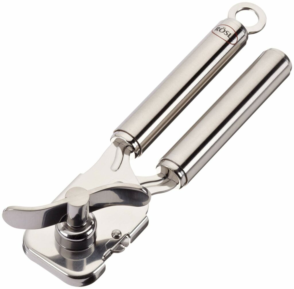
I mean, look at the can opener up at the top of this post. It does the exact same thing as your normal, run-of-the-mill can opener. It opens cans. Easily. But this one, this one has heft. This one looks like it was lovingly designed. This one looks like someone actually cared about how it would feel, how it would function, how it would stand the test of time.
I’d argue that companies who think through their designs the way that Rösle did for this can opener, will be the ones who win both the ease and the cachet game.

