Back to Basics blog post #2 …
One thing I find companies running into all the time is trying to decide how to ensure that 100 percent of people behave EXACTLY the way that they want them to in a certain situation — when a certain choice, a certain option, or certain offer is presented to them.
I’ve listened to teams spend hours, and days, and weeks, and even months debating the smallest nuances of “what if …”
- What if a person figures out that they can hack the “find your cost” tool and holds us to that price quote?? We can’t ensure that price will always be the price! So, we shouldn’t display pricing.
- What if a person gives us the wrong information in a user group?? We’ll be held liable! We should shut all interactions down.
- What if a Customer Success Representative/Loyalty and Retention Representative/Customer Service Representative says something inappropriate?? We should require that they all stick 100 percent to our legal-approved script!
I’ve referred to this as solving for the one percent instead of solving for the 90-plus percent.
Now, as designers — and people who generally want to ensure that we are building the best experience for other people — we do have to spend a bit of time thinking through the scenarios.
And yes, there is a chance that someone will find the hack. Say the wrong thing. Do the wrong thing. But, frankly, is that risk enough of a reason to shut down a project, or an experience, or a product that will do an enormous amount of good?
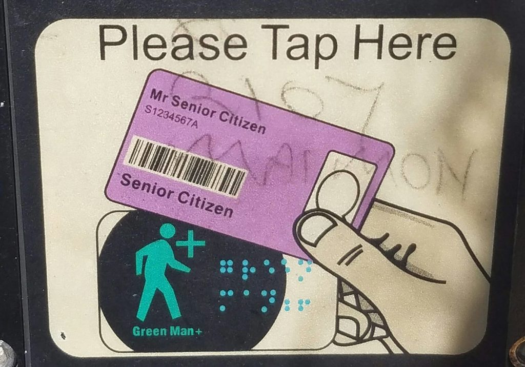
When I returned from several weeks in Singapore, I posted a picture to Chief Customer’s Facebook page about a design element there that I found fascinating. A smart card that tells the crosswalk that person needs extra time to cross the street.
Original Facebook post from Chief Customer’s: page:
Sometimes, the simplest of things can have a dramatic impact on your #customerexperience.
I’ve recently returned from Singapore, where I am lucky enough to have several clients.
Singapore is simply a stunning place. The sights, the smells, the tastes. And it is also is a place where it appears that there is a team in charge of curating the #cx for its citizens.
For example: the transit system is based off of cards. You tap your card to enter and exit a bus. You use your card to access the rail system (which is fabulous!!!).
If you’re a senior citizen, you can tap your card on the reader at crosswalks, and it will add extra time to the crossing cycle.Think about that for a second.
How many times have you seen someone who clearly needs a few extra seconds to finish crossing a street?
Such an elegant solution that makes it easier for people to do something that is key to survival: safely crossing a street.
And it brings dignity to a challenging situation.
Double win.
Oftentimes, the simplest solution is the most elegant.
And the response I got was so interesting to me. Instead of seeing the absolute beauty of solving for a huge human problem, some followers on our page pointed out things like:
- People will stop traffic by abusing this.
- The government can track your movements.
- This is a senseless waste of design.
I share this story with you as a part of our #BacktoCXBasics because I think that this is indicative of what we’re seeing in our profession.
We’ve bifurcated so much, and are so distracted by naysayers, by new tech, by all the things. We aren’t paying attention to some of the most obvious answers that are right in front of us. We’re trying to solve for that one percent instead of making it easy for the other 90-plus percent of the people.
Give someone the equivalent of an extra few seconds to cross a street. I bet the majority of users won’t abuse it.
Because, generally, people are good. Solve for the 90-plus percent. They’ll be glad you did.

